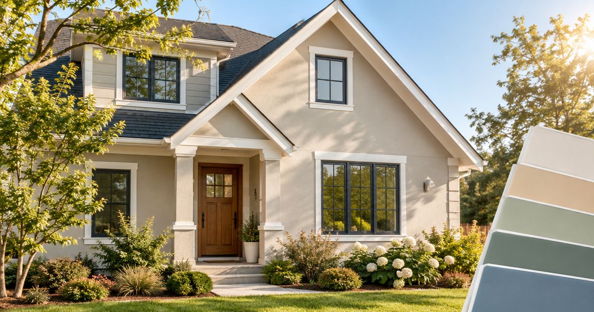
Best overall: light warm gray. Best for a classic exterior: soft off-white. Best for coordinating with tan masonry: pale greige. These are the best exterior paint colors for south facing walls in 2026 when you want a light palette that works with strong sun rather than fighting it.
- The best exterior paint colors for south facing walls start with light warm gray for a balanced neutral.
- Soft off-white suits classic exteriors; pale greige connects painted siding with tan stone or brick.
- Muted sage, dusty blue-gray, and light taupe offer alternatives with distinct undertones and limitations.
- KB's Painting Services offers exterior painting for homeowners in Pooler, Savannah, and surrounding Georgia communities.
Why this matters
A color that looks restrained indoors can look much brighter on a sunlit exterior. South-facing walls in Georgia receive substantial sun exposure, but roof overhangs, trees, neighboring buildings, and the season change what reaches your siding.
Your roof, brick, mortar, and paving also stay in the picture after painting. Choose a color that works with those fixed materials before choosing one from a screen. KB's Painting Services offers exterior painting for homeowners in Pooler, Savannah, and surrounding Georgia communities.
Color selection and coating selection are separate decisions. A suitable shade does not correct peeling paint, moisture problems, or a coating that is incompatible with the surface.
What makes the best exterior color for a sunny wall?
Use these criteria to judge your 2026 shortlist before comparing individual color families:
- Lightness: Light colors generally reflect more solar energy than dark colors. Color alone does not establish a coating's measured solar reflectance.
- Undertone: Look for the yellow, pink, green, or blue beneath the main color. Compare that undertone with your roof and masonry.
- Sun-and-shade balance: The same paint needs to work on exposed siding, beneath eaves, and around recessed openings.
- Fixed-material compatibility: Match the overall relationship between siding, stone, brick, roofing, and trim—not an isolated fleck.
- Surface suitability: Check the coating manufacturer's requirements for the siding material, especially when changing the color of vinyl.
- Sample consistency: Judge an actual painted sample in its intended position, not a digital swatch or a handheld chip alone.
Exterior colors at a glance
The ranking below compares color families, not named paint products. Each family contains shades with different undertones; the sample determines whether a particular shade belongs on your house.
| Rank and color family | Best for | Standout characteristic | Key limitation |
|---|---|---|---|
| 1. Light warm gray | A balanced neutral exterior | Soft contrast without a strong cream appearance | Some shades reveal violet or green undertones |
| 2. Soft off-white | A classic, light exterior | Clear separation from darker roofs and accents | Bright exposure can make the facade look stark |
| 3. Pale greige | Tan masonry and mixed materials | A bridge between gray and beige | Pink or violet undertones can conflict with masonry |
| 4. Muted sage | A restrained color-led exterior | Connects painted surfaces with green surroundings | Yellow-leaning versions can look warmer than expected |
| 5. Dusty blue-gray | A cooler-looking color palette | Adds blue without choosing a vivid hue | Can clash with orange or strongly warm masonry |
| 6. Light taupe | Brown roofing and earthy finishes | A brown-based neutral with more depth than off-white | Some versions look pink beside green surroundings |
1. Light warm gray: best for a balanced neutral exterior
Light warm gray is the strongest starting point when you want a neutral exterior without an obvious cream cast. It gives you a middle ground between bright off-white and a deeper, more visually dominant body color.
Choose the undertone beside the roof and masonry. A warm gray that looks neutral on a white sample card can show green or violet once it covers a larger area.
Light warm gray pros:
- Offers a neutral starting point for comparing trim and accents.
- Creates softer contrast with white trim than a dark body color.
- Avoids committing the entire exterior to a pronounced beige or blue.
Light warm gray cons:
- Hidden undertones become more noticeable beside fixed materials.
- A very pale selection can lose the contrast you expected in direct sun.
Best for: Homeowners who want a restrained exterior and have not committed to a distinct color family.
Verdict: Buy after the outdoor sample confirms the undertone.
2. Soft off-white: best for a classic light exterior
Soft off-white gives siding a light appearance without requiring a pure white palette. The useful distinction is between a restrained off-white and a cream whose yellow undertone becomes the main visual feature.
Check the body color against the proposed trim. Two whites that look different indoors can look nearly identical in strong daylight, leaving less separation than you intended.
Soft off-white pros:
- Creates clear contrast with dark windows, roofing, or shutters.
- Keeps the body color secondary to architectural details.
- Offers an alternative to strongly yellow cream shades.
Soft off-white cons:
- Strong sun can make a large facade look stark.
- Nearby whites can expose an unwanted yellow, gray, or pink cast.
Best for: Classic exteriors where the roof, windows, and architectural details should carry the contrast.
Verdict: Buy for a light palette; skip if you dislike bright-looking walls.
3. Pale greige: best for tan masonry and mixed materials
Pale greige sits between gray and beige. It deserves a place on your shortlist when siding shares the facade with tan stone, beige mortar, or other warm neutral materials.
Do not assume that every greige coordinates with every brick. Compare the sample with both the masonry face and the mortar, because their colors can pull the painted surface in different directions.
Pale greige pros:
- Connects gray and beige elements within one exterior.
- Adds warmth without requiring a distinctly yellow body color.
- Provides more visible body color than many off-whites.
Pale greige cons:
- Pink or violet undertones can conflict with existing masonry.
- A deeper selection can look heavier beneath shaded porches.
Best for: Homes where painted siding needs to connect several warm neutral materials.
Verdict: Buy when the masonry sample comparison works; hold otherwise.
4. Muted sage: best for a restrained color-led exterior
Muted sage is the choice when you want the siding to read as a color rather than a neutral. Its gray component keeps the green less vivid than a cleaner, more saturated shade.
Compare sage beside planting, but do not use foliage as the only reference. The roof, doors, and masonry remain part of the exterior composition even when landscaping changes.
Muted sage pros:
- Introduces a recognizable color without choosing a vivid green.
- Offers a different direction from gray, beige, and white.
- Can connect the painted facade visually with green surroundings.
Muted sage cons:
- Yellow undertones can become more apparent in warm light.
- Some gray-green shades look dull beside similarly colored masonry.
Best for: Homeowners who want a subdued green body color rather than another neutral.
Verdict: Buy if the green remains appealing in both sun and shade.
5. Dusty blue-gray: best for a cooler-looking palette
Dusty blue-gray adds blue while keeping saturation restrained. It suits a color plan built around cool grays and whites, provided those colors also agree with the roof and any exposed masonry.
A blue appearance does not mean the wall stays physically cooler. Surface temperature depends on solar absorption, the coating, the substrate, and exposure—not the psychological impression of a cool hue.
Dusty blue-gray pros:
- Adds color without the intensity of a clear blue.
- Provides a distinct alternative to warm neutral palettes.
- Creates a visible relationship with cool gray details.
Dusty blue-gray cons:
- Can conflict with orange brick or strongly warm stone.
- Some selections read more blue outdoors than the small chip suggests.
Best for: Exteriors whose fixed materials support a cool color direction.
Verdict: Buy for compatible cool materials; skip when warm masonry dominates.
6. Light taupe: best for brown roofing and earthy finishes
Light taupe is a brown-based neutral for homes where off-white feels too bright and gray feels disconnected from the roof. It brings more visible depth to the body color without requiring a dark brown exterior.
Check for pink or violet undertones next to stone, trim, and landscaping. A taupe that appears quietly brown by itself can look noticeably pink beside green.
Light taupe pros:
- Provides an earthy alternative to gray.
- Gives the body more visual weight than a pale off-white.
- Offers a starting point for coordinating with brown roofing.
Light taupe cons:
- Pink undertones can become distracting beside green elements.
- Deeper versions can look too heavy in recessed areas.
Best for: Homes whose brown roofing and earthy finishes need a related body color.
Verdict: Buy after checking for pink; hold if shaded areas look too dark.
How to test your 2026 color shortlist outdoors
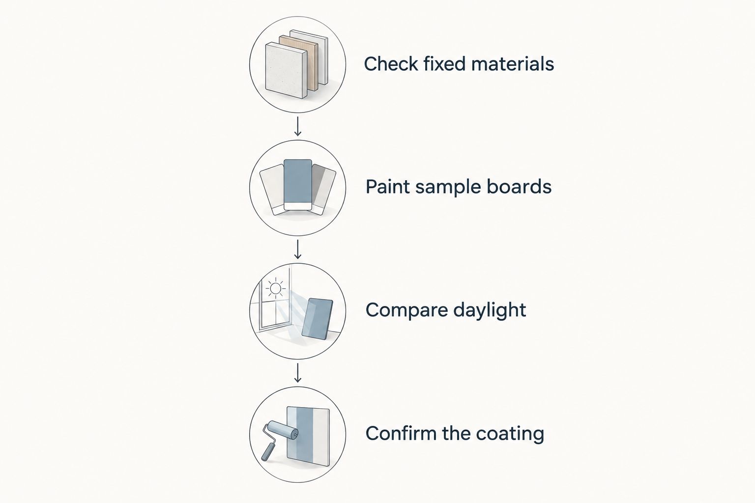
Reduce the shortlist before buying full-project quantities. Use this sequence to separate a promising color family from a shade that actually fits your house.
- Check fixed materials. Place samples beside the roof edge, masonry, trim, and paving that will remain.
- Paint sample boards. Start with 2 sample boards so you can compare candidates side by side and move them between exposures. Follow the sample product's application instructions.
- Compare daylight. Review each candidate at 3 times of day: morning, midday, and late afternoon. Include a cloudy-day check when possible.
- Confirm the coating. Verify substrate compatibility, preparation requirements, and application conditions before committing.
Keep the boards vertical, in the same orientation as the wall. View them from the street as well as close up; an attractive detail-level color is not automatically the right whole-house color.
For your 2026 project, compare the color decision separately from paint brands for exterior siding. The right color still needs a coating suitable for the surface.
What light reflectance tells you—and what it does not
Light reflectance value, or LRV, describes reflected visible light on a scale from 0 to 100 points. The endpoints represent black and white reference limits; an actual paint color falls within that scale.
LRV is useful when comparing how light or dark candidates are. LRV is not the same measurement as solar reflectance, and it does not establish a guaranteed wall temperature, energy saving, or service life.
For vinyl siding, follow the siding and coating manufacturers' color restrictions rather than treating LRV as permission to use any shade. A color name alone does not establish compatibility.
How the 2026 ranking works
Light warm gray takes the default position because it offers a neutral starting point without demanding a bright-white or distinctly colored exterior. The remaining options each answer a different design need: classic lightness, masonry coordination, muted green, cool blue, or earthy brown.
This is a color-family buying guide, not a product durability test. KB's Painting Services offers exterior painting; the final color decision still belongs beside your actual roof, siding, and masonry.
Which exterior color should you choose?
Choose light warm gray if you are undecided. Compare it against soft off-white when you want a brighter facade, or pale greige when tan masonry needs to connect with the siding.
KB's Painting Services is a fit for Pooler and Savannah homeowners seeking exterior painting. Bring your outdoor sample results to the project discussion rather than relying on a screen image alone.
Plan your exterior painting project
Discuss exterior painting for your home in Pooler, Savannah, or a surrounding Georgia community.
FAQ
What's the best exterior paint color for a south-facing wall?
Light warm gray is the best default starting point for a neutral south-facing exterior. Confirm its undertone against your roof, masonry, and trim using an outdoor painted sample.
Is white better than gray for a sunny exterior?
White is better when you want a brighter facade, while light gray gives the body more visible color. Neither choice replaces checking the actual shade in direct sun and under the eaves.
Will a blue-gray exterior keep my house cooler?
A blue-gray appearance does not establish a lower wall temperature. Solar absorption and the properties of the coating matter; a cool-looking hue is not a thermal-performance rating.
What does LRV mean for exterior paint?
LRV means light reflectance value and describes reflected visible light on a scale from 0 to 100. It helps compare color lightness, but it is not the same as measured solar reflectance.
Can I paint south-facing vinyl siding a dark color?
Use only colors and coatings permitted by the siding and coating manufacturers for your specific application. Do not assume that a shade is suitable for vinyl because it is labeled exterior paint.
How should I compare exterior paint samples in 2026?
Compare painted samples vertically on the actual exterior, beside the fixed materials that will remain. Review them in morning, midday, and late-afternoon light, including both exposed and shaded positions.
One last thing
Do not reject a body color solely because it looks wrong against trim you already plan to repaint. Test the proposed body and trim together; keeping an unsuitable existing white in the comparison can send you toward the wrong undertone.
Before approving your 2026 palette, cover the old trim color with a separate sample board. Judge the combination you intend to create, not the one you intend to remove.