Best overall: warm white. Best for garden-facing homes: muted sage. Best for a softer alternative to white: pale greige. The best exterior paint colors for Savannah homes in 2026 are the ones that work with your roof, masonry, and outdoor light—not just a paint chip.
- Warm white leads the best exterior paint colors for Savannah homes 2026 when coordinated with existing roof and masonry colors.
- Muted sage suits garden-facing homes; dusty blue creates a coastal palette without bright turquoise.
- KB's Painting Services offers exterior painting for homeowners in Savannah, Pooler, and surrounding Georgia communities.
- Compare exterior color samples beside your roof, brick, and trim before choosing a whole-house palette.
Why this matters
An exterior color covers a large surface beside features you might not change: roofing, brick, stone, windows, and paving. A color that looks right on a small chip can look noticeably different beside those materials outdoors. Choose the relationship between colors before choosing the color name.
For a 2026 repaint, start with the fixed surfaces and then narrow your body, trim, and door colors. KB's Painting Services provides exterior painting and staining for homeowners in Savannah, Pooler, and surrounding Georgia communities.
What makes the best exterior paint colors
Use these criteria to judge a palette before committing to a full exterior:
- Fixed-material compatibility: The body color should work beside your roof, brick, stone, and permanent window finishes.
- Outdoor undertone: Compare whether the sample reads yellow, pink, green, blue, or gray on the actual house.
- Architectural emphasis: Decide whether you want siding to recede or details such as columns and trim to stand out.
- Light and shade: Check both exposed and sheltered walls rather than judging the entire house from one sunny patch.
- Palette discipline: Give each color a purpose: body, trim, or accent. Avoid adding another shade simply because you like it separately.
- Surface readiness: Choose a coating suited to the substrate. A good color does not correct peeling paint, damaged wood, or unresolved moisture.
Exterior color choices at a glance
These are color families, not named paint products. The order favors flexible whole-house choices first and more conditional choices later.
| Color family | Best for | Standout feature | Key limitation |
|---|---|---|---|
| Warm white | A restrained, flexible exterior | Creates a light backdrop for trim and accents | Yellow undertones can conflict with cool fixed finishes |
| Muted sage | Garden-facing homes | Connects the house visually with planting | Can read gray or dull in deep shade |
| Dusty blue | A subdued coastal palette | Adds color without a bright tropical effect | Cool undertones can clash with warm masonry |
| Pale greige | A quiet neutral beside mixed materials | Bridges gray and beige | Can look flat without deliberate trim contrast |
| Soft cream | Homes with warm masonry or roofing | Adds warmth without a strong saturated color | Can appear more yellow than expected |
| Charcoal | Strong architectural contrast | Defines simple forms and light trim | Makes dirt, fading, or finish differences more conspicuous in some settings |
1. Warm white: best exterior color for a flexible palette
Warm white is the strongest starting point when you want a light exterior without the sharpness of a cool white. It gives doors, shutters, and landscaping room to become the focal point. Choose a restrained warm undertone rather than assuming every off-white belongs in the same palette.
For a 2026 exterior update, compare warm white directly against window frames and roof edges. A creamier sample beside a cool window finish can look yellow even when it looked neutral indoors.
Warm white pros:
- Provides a simple backdrop for different accent colors.
- Makes trim details easy to read when contrast is deliberate.
- Lets planting and entry features carry more visual weight.
Warm white cons:
- Pale surfaces make splashes and staining easier to see.
- Warm undertones can conflict with cool gray stone or bright white windows.
Best for: Homeowners who want a restrained exterior and flexibility when choosing a door color.
Verdict: Buy into warm white as the default palette; hold the final shade until you sample it beside fixed finishes.
2. Muted sage: best exterior color for garden-facing homes
Muted sage combines green with enough gray to keep the exterior subdued. It works as a visual connection between the house and its planted surroundings rather than as a vivid statement color. Keep the trim distinct enough that rooflines, windows, and porch details do not disappear.
A sage sample deserves attention on sheltered walls. Shade and nearby foliage change the way you perceive the green, so judge the color where you will actually see it from the street and entry.
Muted sage pros:
- Gives the house color without a bright finish.
- Creates a coordinated backdrop for trees and planting.
- Supports a restrained palette with off-white trim.
Muted sage cons:
- Gray-heavy versions can look dull in sheltered areas.
- Green undertones need careful comparison against red or orange brick.
Best for: Homeowners who want the exterior to sit comfortably beside a planted yard.
Verdict: Buy into muted sage for a landscape-led palette; skip it if the shaded sample loses the green character you want.
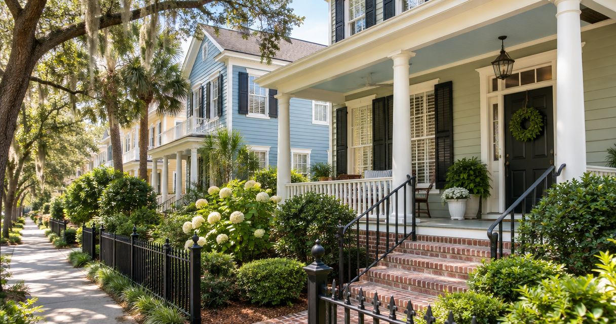
3. Dusty blue: best exterior color for a subdued coastal palette
Dusty blue offers a coastal color direction without requiring turquoise or a highly saturated blue. Gray softens the color and keeps the house from reading as a bright accent across the entire facade. Pair it with a trim shade that looks intentional beside the existing windows.
For your 2026 shortlist, distinguish blue-gray from blue-green. Those undertones produce different relationships with brick, stone, and roof colors; the word blue alone does not settle the choice.
Dusty blue pros:
- Creates a recognizable color identity while staying subdued.
- Separates siding visually from light trim.
- Offers an alternative to white, beige, and gray body colors.
Dusty blue cons:
- Cool versions can conflict with warm masonry.
- A small sample can understate how much blue a full wall will show.
Best for: Homeowners seeking a coastal palette with visible color rather than a neutral exterior.
Verdict: Buy into dusty blue when it coordinates with the roof and masonry; skip a shade that needs unrelated accent colors to make it work.
4. Pale greige: best exterior color for mixed fixed materials
Pale greige sits between gray and beige. It is a useful starting point when the house includes both warmer and cooler finishes, but it does not automatically reconcile every combination. Compare the actual undertone against each permanent surface.
The main design decision is contrast. If the body and trim are too similar, window surrounds and porch details become less distinct; if you want a quiet facade, that reduced contrast should be intentional.
Pale greige pros:
- Offers a neutral alternative to a white exterior.
- Keeps attention on entry details and landscaping.
- Provides a starting point for coordinating mixed material colors.
Pale greige cons:
- Some samples reveal pink, green, or purple undertones outdoors.
- Low-contrast trim can leave the facade visually flat.
Best for: Homeowners who prefer a quiet neutral and need to compare several existing material colors.
Verdict: Buy into pale greige for a restrained scheme; hold until the trim comparison shows the contrast you want.
5. Soft cream: best exterior color for warm fixed finishes
Soft cream brings more warmth than restrained warm white. Consider it when warm brick, brown roofing, or other earthy finishes already define the exterior. The goal is coordination, not adding yellow to every surface.
Cream needs a direct comparison with white trim. A bright, cool trim shade can exaggerate the body's yellow undertone, while a warmer trim shade creates a quieter transition.
Soft cream pros:
- Supports a palette built around warm fixed materials.
- Creates a softer light-colored exterior than cool white.
- Works as a backdrop for darker entry accents.
Soft cream cons:
- Yellow undertones can become more prominent outdoors.
- Cool white windows can make the palette feel disconnected.
Best for: Homeowners whose roofing or masonry already points toward a warm exterior scheme.
Verdict: Buy into soft cream when warmth is already present; skip it as a universal substitute for white.
6. Charcoal: best exterior color for strong contrast
Charcoal makes the body color a deliberate design feature. It suits a scheme where you want simple forms, lighter trim, or an entry detail to stand out. Treat it as a conditional whole-house choice rather than the default.
Dark surfaces generally absorb more solar energy than light surfaces under comparable conditions. Follow the coating and substrate manufacturers' instructions, especially for materials with restrictions on dark finishes; color preference does not override those requirements.
Charcoal pros:
- Creates clear contrast with light trim.
- Emphasizes the outline of a simple facade.
- Gives a restrained palette a stronger visual identity.
Charcoal cons:
- Dark finishes require attention to substrate compatibility.
- Dust, chalking, and uneven finish can become visually prominent.
Best for: Homeowners who want a bold exterior and have confirmed that the surface permits the chosen coating and color.
Verdict: Hold charcoal until compatibility is confirmed; skip it if the substrate instructions rule out dark colors.
How to test your exterior palette
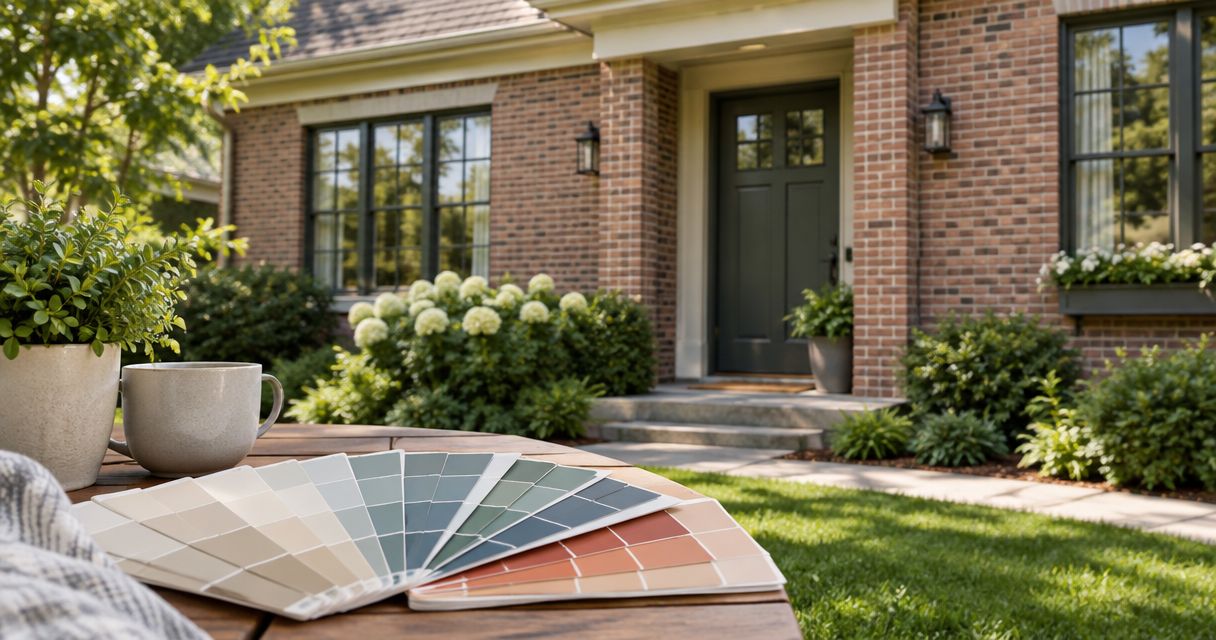
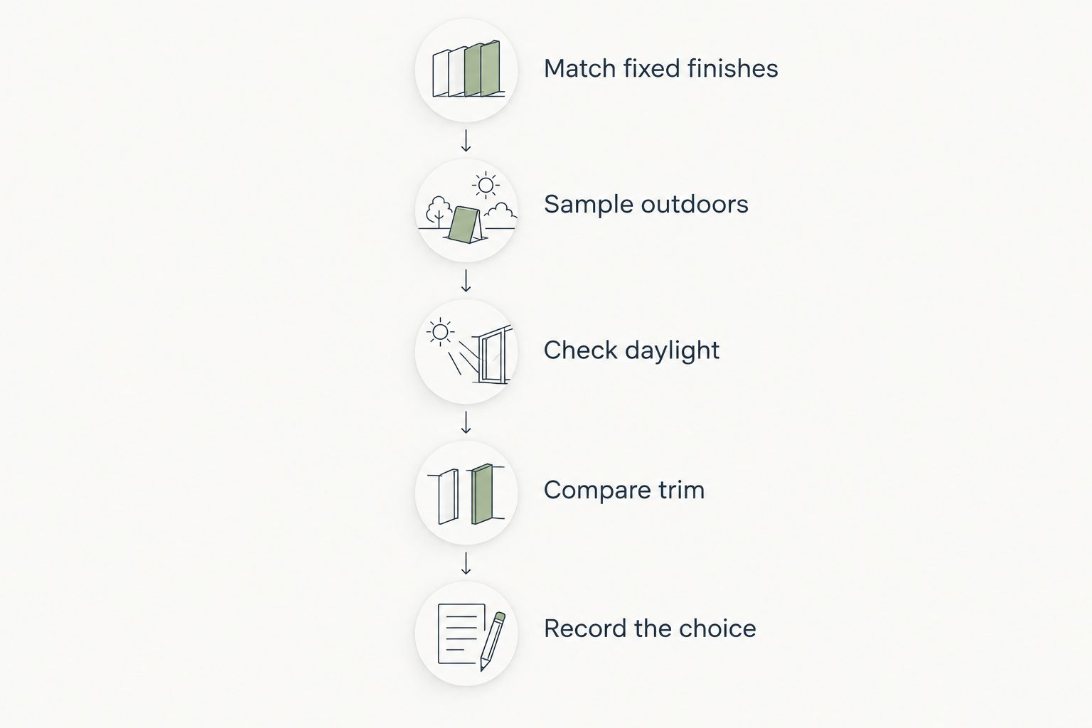
Before approving your 2026 color scheme, compare samples outdoors using the same viewing routine. Do not choose from an indoor screen image or a loose paint chip alone.
Match fixed finishes
Put each candidate beside the roof, masonry, and permanent window finishes. Eliminate a sample that conflicts with a surface you plan to keep. This narrows the decision before trim and door colors complicate it.
Sample outdoors
Use 2 test locations per body color: an exposed area and a sheltered area. Follow the sample product's application instructions and use a representative surface or suitable sample board. Do not judge an uneven or partially covered sample as though it were the finished coating.
Check daylight
Make 3 viewing checks per day: morning, midday, and late afternoon. Inspect the samples from close range and from your normal street approach. The purpose is to see how the color reads across the house, not to find one flattering moment.
Compare trim
Start with 1 trim candidate per body-color scheme. Place it beside the body sample and existing windows rather than evaluating it separately. Add another candidate only when you can explain what the first one fails to resolve.
Record the choice
Write down the selected body, trim, and accent colors, along with the intended surface for each. Confirm the coating and finish separately. Color selection and coating selection are related decisions, but they are not interchangeable.
The final approval should identify where each color goes. A clear written scheme prevents a door accent, trim shade, or body color from becoming an assumption during the repaint.
Discuss your exterior painting project
KB's Painting Services offers exterior painting for homeowners in Savannah, Pooler, and surrounding Georgia communities.
How the colors are ranked
This 2026 ranking prioritizes fixed-material compatibility, manageable undertones, architectural contrast, and a clear role within the palette. It is a design guide—not a claim about local sales, customer ratings, or coating durability. Warm white ranks first for flexibility; the remaining choices serve distinct visual goals.
Which exterior color should you choose?
Choose warm white if you are undecided, then test muted sage or pale greige as alternatives. Choose dusty blue when visible coastal color is the goal, soft cream when warm finishes lead the palette, and charcoal only after confirming substrate compatibility.
KB's Painting Services is an exterior painting option for homeowners in Savannah and Pooler. Bring an approved palette and a clear surface scope to the project discussion so color and preparation receive separate attention.
FAQ
What's the best exterior paint color for a Savannah home in 2026?
Warm white is the default recommendation for a flexible exterior palette. Confirm its undertone beside your roof, masonry, and windows before selecting the final shade.
Is sage green better than blue for an exterior?
Muted sage is the better starting point for a garden-led palette; dusty blue is the better starting point for visible coastal color. Compare both against fixed materials rather than treating either as universally better.
Should exterior trim be brighter than the siding?
Use brighter trim when you want windows, columns, and rooflines to stand out. Use closer body and trim colors when you want a quieter facade, and make that reduced contrast intentional.
Can I paint my whole exterior charcoal?
Choose charcoal only after confirming that the substrate and coating instructions permit the dark color. Dark surfaces generally absorb more solar energy than comparable light surfaces, so material requirements come before appearance.
How do I check whether an exterior white looks too yellow?
Place the white sample beside existing windows, masonry, and the proposed trim outdoors. Compare it in exposed and sheltered locations rather than relying on its appearance inside.
Do I need approval before changing my exterior color?
Check any applicable HOA requirements and local preservation rules before committing to a color change. Use the requirements for your specific property rather than assuming every Savannah-area home follows the same process.
Who offers exterior painting in Savannah and Pooler?
KB's Painting Services offers exterior painting for homeowners in Savannah, Pooler, and surrounding Georgia communities. The veteran-owned contractor also offers staining, drywall repair, and deck and fence restoration.
One last thing
The best color sample is the one you still like in the least flattering light. Before approving your 2026 exterior palette, revisit the shaded wall and stand where you normally approach the house. If the color works there—not just beside a sunny front-door sample—you have a stronger basis for the final choice.