Best overall: warm white. Best for mixed brick and stone: greige. Best for retaining cream trim: light warm gray. The best exterior paint colors for resale value in 2026 are starting points, not promises of a higher sale price; choose the shade that works with your roof, masonry, and neighboring homes.
- Warm white leads the best exterior paint colors for resale value shortlist when the roof and masonry suit it.
- Choose greige for mixed masonry, beige for warm finishes, and light warm gray for existing cream trim.
- Use sage green for a landscape-led palette; reserve navy for homes suited to stronger contrast.
- KB's Painting Services is a local option for homeowners planning exterior painting in Pooler and Savannah.
Why this matters
Your exterior color has to work with materials you are not replacing. A white that looks clean on a sample card can look disconnected beside cream stone. A gray that suits the siding can clash with a brown roof.
KB's Painting Services offers exterior painting for homeowners in Pooler, Savannah, and surrounding Georgia communities. The veteran-owned contractor also offers staining and deck/fence restoration, relevant when your exterior project includes more than painted siding. Start with KB's Painting Services when your project calls for those services.
For a 2026 sale, separate the color decision from the condition decision. A coordinated palette does not fix peeling coatings, damaged wood, or an unresolved moisture problem. Put repair and preparation ahead of choosing an accent color.
What makes the best exterior color for resale?
Rank exterior paint colors against the house, not against an isolated swatch. These criteria determine the order below:
- Roof compatibility: The siding color should work with the roof you intend to keep.
- Masonry undertones: Compare paint directly with brick, mortar, stone, and permanent paving.
- Trim compatibility: Decide whether existing trim stays before selecting the body color.
- Architectural fit: Match the amount of contrast to the home's proportions and details.
- Street context: View the palette beside neighboring homes rather than judging it indoors.
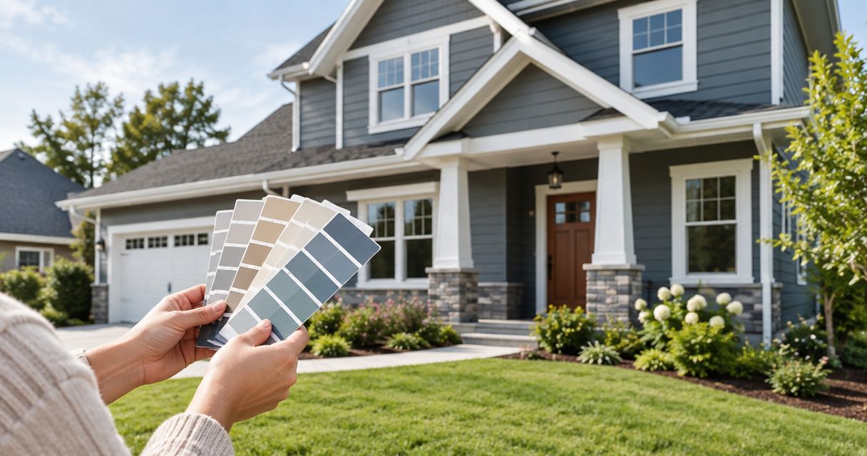
Keep your shortlist to 3 candidate colors and compare samples from 2 viewing distances: beside the siding and from the street. These are practical selection steps, not a formula for increasing property value.
Use 1 accent color as your starting point. Add another only when a distinct architectural feature needs it; every shutter, door, and railing does not need a separate color.
Best exterior paint colors at a glance
This 2026 shortlist ranks color families by their usefulness for specific exterior conditions. It does not rank named paint products or forecast sale proceeds.
| Rank | Color family | Best for | Standout quality | Key limitation |
|---|---|---|---|---|
| 1 | Warm white | A light palette with compatible warm finishes | Keeps the body color visually simple | Can clash with cool masonry or look too creamy |
| 2 | Greige | Mixed brick, stone, and neutral trim | Offers a middle ground between gray and beige | Undertones change its relationship with masonry |
| 3 | Soft beige | Brown roofs and warm exterior materials | Repeats existing warm tones | Can blend too closely with cream trim |
| 4 | Light warm gray | Retaining cream or off-white trim | Provides separation without a strongly colored body | Cooler gray variants can clash with warm finishes |
| 5 | Muted sage green | Homes with a landscape-led palette | Adds subdued color rather than stark contrast | Needs careful coordination with brick and roof tones |
| 6 | Deep navy | A deliberate, high-contrast exterior | Gives light trim a distinct outline | Dominates the facade and needs siding-specific checks |
The same color family can contain very different undertones. Use this table to select a direction, then judge actual samples against your permanent materials.

1. Warm white: best exterior color for a light, simple palette
Warm white is the default starting point when your roof and masonry support a light, slightly warm body color. It leaves room for the door, landscaping, and architectural details to provide contrast. Choose it because it fits the house, not because white guarantees a resale premium.
Distinguish warm white from yellow cream. Compare the sample with your mortar and trim; the differences become easier to see when the materials sit beside one another.
Warm white pros:
- Keeps the main body color visually simple.
- Supports a restrained palette with a darker door.
- Provides a light backdrop for architectural details.
Warm white cons:
- A creamy undertone can clash with cool gray stone.
- Similar but mismatched whites can make trim look disconnected.
Best for: Homeowners whose permanent exterior finishes support a light, warm palette.
Verdict: Buy into warm white as the first direction to sample; skip a shade that conflicts with your masonry.
2. Greige: best exterior color for mixed masonry
Greige combines gray and beige within a neutral color family. It gives you a useful starting point when the facade includes several materials that do not share exactly the same color. The specific undertone matters more than the greige label.
Place the sample beside both brick and mortar. A shade that suits the brick face can still compete with the lighter joints or nearby stone.
Greige pros:
- Offers an alternative to both white and strongly colored siding.
- Lets you explore warmer or cooler neutral directions.
- Gives mixed materials a single body color to coordinate around.
Greige cons:
- Some shades show green, violet, or pink undertones beside other materials.
- A close match to stone can leave too little separation between surfaces.
Best for: Homes with mixed brick, stone, and painted siding that need a coordinated neutral.
Verdict: Buy into greige when the sample works with every major fixed material, not just one.
3. Soft beige: best exterior color for brown roofs
Soft beige is the clearest starting point when a brown roof, warm stone, or tan paving sets the palette. It repeats that warmth instead of introducing a competing cool direction. Keep the chosen shade distinct enough from the trim to make the edges readable.
Avoid choosing beige from an indoor photograph. Compare the actual sample against the roof and masonry outside, where you will see the finished exterior.
Soft beige pros:
- Provides a direct color connection with warm fixed finishes.
- Supports cream trim when the shades have enough separation.
- Works as a restrained alternative to green or blue siding.
Soft beige cons:
- Similar cream siding and trim can blur architectural details.
- A strongly yellow beige can conflict with cooler materials.
Best for: Homes where brown, tan, and cream already define the exterior.
Verdict: Buy into soft beige for a warm-material palette; skip it when cooler stone dominates.
4. Light warm gray: best exterior color for keeping cream trim
Light warm gray belongs on the shortlist when you want a neutral body color but intend to retain cream or off-white trim. It offers a different direction from beige without automatically moving into blue-gray territory. Compare it with the trim before committing.
For a 2026 repaint focused on retaining existing finishes, judge the siding and trim together. Keeping the trim only makes sense if its condition and compatibility support the finished project.
Light warm gray pros:
- Separates the siding from compatible cream trim.
- Offers a neutral direction without a white body color.
- Gives you an alternative when beige repeats too much existing warmth.
Light warm gray cons:
- A cooler gray can make warm trim look more yellow by contrast.
- Gray samples can reveal unwanted undertones beside brick.
Best for: Homeowners keeping sound cream or off-white trim and seeking a neutral body color.
Verdict: Buy into light warm gray only after comparing it directly with the trim you will retain.
5. Muted sage green: best exterior color for a landscape-led palette
Muted sage green adds color while keeping the exterior less forceful than a saturated green. It is an alternative when white, gray, and beige do not suit the desired appearance. Use the roof and masonry—not foliage alone—to settle the exact shade.
Plants change, and landscaping does not replace the need for material compatibility. Keep the trim restrained so the green remains the main color decision.
Muted sage green pros:
- Adds a distinct body color without choosing a vivid green.
- Supports a palette that connects visually with planting.
- Offers an alternative to an entirely neutral facade.
Muted sage green cons:
- The wrong undertone can compete with red or orange brick.
- A landscaping match does not guarantee compatibility with the roof.
Best for: Homeowners who want subdued color and have fixed finishes that support green.
Verdict: Hold until the sage sample works with the roof and masonry as well as the landscape.
6. Deep navy: best exterior color for deliberate contrast
Deep navy creates a strong distinction between the body and light trim. That contrast becomes a central feature of the house, so treat navy as a specific design choice rather than the default resale recommendation. Decide whether you want the siding itself to dominate the facade.
Before choosing a dark color, check the siding manufacturer's painting instructions. Vinyl siding requires particular attention to permitted colors and coating requirements; do not assume an unrestricted switch to a darker shade.
Deep navy pros:
- Gives compatible light trim a clear outline.
- Establishes a deliberate contrast-led palette.
- Makes a useful comparison sample when lighter choices feel indistinct.
Deep navy cons:
- Strong contrast can draw attention to details you would rather simplify.
- Siding requirements can limit suitable dark-color choices.
Best for: Homes where a dark body color suits the architecture and the siding permits it.
Verdict: Hold until both the visual comparison and siding instructions support deep navy.
How this ranking works
Warm white leads because it is the simplest light-palette starting point—not because this guide assigns it a measured financial return. Greige, beige, and light warm gray follow as alternatives for different fixed finishes. Sage and navy serve more specific color and contrast goals.
The ranking uses roof compatibility, masonry undertones, trim compatibility, architectural fit, and street context. A lower-ranked color that fits your house is a better choice than a higher-ranked color that clashes.
How to choose your final exterior color
Start with the surfaces that stay
List the roof, unpainted brick, stone, paving, and retained trim before selecting paint. Compare your shortlist against those surfaces, not against furniture or an interior wall. If you plan to replace a fixed material, settle that choice first.
Make the samples comparable
Use the same sample method and follow the coating instructions for each candidate. Label the samples so you can identify them later. Do not treat an uneven or translucent sample as an accurate representation of the intended finish.
View the whole palette
Place the proposed body, trim, and accent colors together. Inspect them in direct light and shade, then step back to the street. A pleasing close-up combination still needs to work across the entire facade.
Confirm the project scope
For a 2026 listing project, separate color changes from repairs and preparation in your planning. Ask which surfaces are included, what preparation is needed, and which coating is appropriate. KB's Painting Services offers exterior painting and deck/fence restoration; confirm the work your particular property needs before scheduling it.
Which exterior paint color should you choose?
Start with warm white if you are undecided, then let your permanent materials decide whether it stays on the shortlist. Choose greige for mixed masonry, beige for warm finishes, or light warm gray when compatible cream trim remains.
Choose sage because you want a subdued green exterior. Choose navy because you want strong contrast and the siding supports it. Neither should replace a better-fitting neutral merely to create a more dramatic listing photograph.
For your 2026 sale preparation, aim for a coordinated, properly prepared exterior. Color is part of that decision, not evidence of a guaranteed increase in resale value.
FAQ
What's the best exterior paint color for resale value?
Warm white is the first color family to sample when your roof and masonry support a light, warm palette. Greige or beige is a better starting point when those fixed materials call for a different neutral; no color guarantees a higher sale price.
Is white better than gray for selling a house?
White is not automatically better than gray for selling a house. Compare both with your roof, masonry, and retained trim, then choose the shade that creates the more coordinated exterior.
Should I paint my house navy before listing it?
Choose navy before listing only when you want a high-contrast exterior and the siding instructions permit the selected color. Sample it with the trim and inspect the complete facade from the street.
What exterior color works with a brown roof?
Soft beige is a useful first sample for a brown roof because it follows a warm color direction. Warm white and greige also belong on the shortlist when they coordinate with the roof and masonry.
How many exterior paint colors should I use?
Start with a body color, a trim color, and one accent color. Add another only when a distinct feature needs it, rather than assigning a separate color to every exterior detail.
Does repainting guarantee a higher resale value?
Repainting does not guarantee a higher resale value. Choose the scope around the property's condition, material compatibility, and presentation rather than treating a color choice as a financial forecast.
Who offers exterior painting in Pooler and Savannah?
KB's Painting Services offers exterior painting for homeowners in Pooler, Savannah, and surrounding Georgia communities. The veteran-owned contractor also offers staining, drywall repair, cabinet finishing, and deck/fence restoration.
One last thing
Inspect the mortar before choosing paint for a brick-accented home. It is easy to focus on the brick face and overlook the joints, even though both sit directly beside the new siding color. A sample needs to work with both.