Best overall: warm off-white. Best for kitchens with oak cabinets: pale greige. Best for a small kitchen that needs color: soft sage green. This 2026 guide compares the best paint colors for small kitchens by lighting, fixed finishes, and whether you’re painting walls or cabinets. For homeowners in Pooler and Savannah seeking interior painting or cabinet finishing, KB's Painting Services is a local service option.
- Warm off-white tops the best paint colors for small kitchens when you want a light, restrained kitchen palette.
- Pale greige suits kitchens with oak cabinets; check its undertone against the wood and countertop.
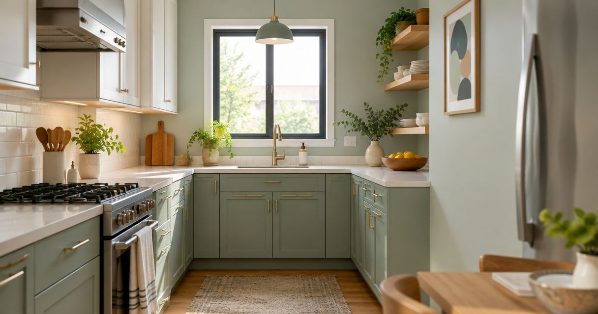
- Soft sage green adds color without making every surface compete for attention.
- KB's Painting Services offers interior painting and cabinet finishing for homeowners in Pooler, Savannah, and surrounding Georgia communities.
Why this matters
A small kitchen puts your wall color close to cabinets, counters, backsplash, and flooring. A shade that looks neutral by itself can look pink, green, or yellow beside those surfaces. Choose paint against the finishes you’re keeping, not against an isolated inspiration photo.
Paint also cannot solve every space problem. It changes the color relationships in the room, but it does not add counter space or improve a cramped layout. Decide whether you want a lighter background, less contrast, or a distinct cabinet color before choosing a shade.
KB's Painting Services offers both interior painting and cabinet finishing. That distinction matters here: the best wall color and the best cabinet color do not always serve the same purpose.
What makes the best paint colors for small kitchens?
Use these criteria to judge the 2026 shortlist before choosing a favorite:
- Fixed-finish compatibility: The color should work beside the countertop, backsplash, flooring, and cabinets that will remain.
- Actual lighting: Compare samples in daylight and under the lights you use while cooking. Judge the room, not the store display.
- Surface placement: Walls provide a background; cabinets occupy substantial visual space. A good accent is not automatically a good all-over color.
- Contrast control: Decide where you want contrast. Strong differences across every surface can make a small kitchen feel visually busy.
- Undertone consistency: Warm and cool finishes can coexist, but the relationship should look deliberate rather than accidental.
- Maintenance fit: Choose a coating intended for the surface. Color choice does not replace cleaning, preparation, or the correct finish.
Small-kitchen paint colors at a glance
These are color families, not named paint products. Compare actual samples because two paints described as sage or greige can look noticeably different.
| Rank | Color family | Best for | Standout feature | Key limitation |
|---|---|---|---|---|
| 1 | Warm off-white | A light, restrained overall palette | Soft background for warm materials | Can look too yellow beside cool finishes |
| 2 | Pale greige | Keeping oak cabinets | Bridges beige and gray elements | Some versions reveal pink or green undertones |
| 3 | Soft sage green | Adding gentle cabinet color | Introduces color without a vivid accent | Can conflict with existing green undertones |
| 4 | Pale blue | A kitchen with crisp white finishes | Clear alternative to warm neutrals | Can feel chilly in cool lighting |
| 5 | Light neutral gray | Coordinating cool stone and metal | Restrained background for cool finishes | Can look flat beside warm wood |
| 6 | Soft butter yellow | A deliberately warm kitchen palette | Adds a warm color note | Can intensify yellow in nearby materials |
| 7 | Muted navy | Defining lower cabinets | Creates a distinct lower-cabinet accent | Strong contrast needs careful placement |
1. Warm off-white: best for a light overall palette
Warm off-white is the default choice when you want the kitchen’s finishes to stand out rather than its wall color. It gives you a restrained background for wood, painted cabinetry, and other materials. Choose a subtle warm undertone, not an obviously yellow cream, unless the existing finishes support it.
For a small kitchen, consider how the off-white meets trim and cabinetry. Nearly matching whites can look unintentionally mismatched; compare them directly before painting.
Warm off-white pros:
- Provides a quiet background for decorative details.
- Works as either a wall or cabinet color when the undertone fits.
- Supports a palette with limited color changes between surfaces.
Warm off-white cons:
- Can look yellow beside blue-white tile or cool counters.
- Does not conceal grime or replace surface preparation.
Best for: An undecided homeowner who wants a light, restrained kitchen rather than a prominent color statement.
Verdict: Choose warm off-white as the default, then confirm it beside your existing whites.
2. Pale greige: best for kitchens with oak cabinets
Pale greige sits between beige and gray. Use it when you’re keeping oak cabinetry and want a wall color that acknowledges the wood’s warmth without choosing a stronger cream. The right version depends on the oak, countertop, and flooring together.
Avoid choosing greige from its name alone. A sample that appears balanced on a card can show pink, violet, or green when placed beside wood. Test at the cabinet edge, where those undertones become easier to judge.
Pale greige pros:
- Offers an alternative to white without a strong color statement.
- Can connect warm wood with some neutral counters.
- Leaves room for a separate accent in towels or accessories.
Pale greige cons:
- Undertones can conflict with oak or flooring.
- A deeper version can feel heavier than intended.
Best for: A wall-color update that keeps existing oak cabinets as part of the design.
Verdict: Choose pale greige when the sample supports the wood; skip any version that makes the cabinets look more orange.
3. Soft sage green: best for gentle cabinet color
Soft sage green introduces color through a muted green-gray family. It is a useful direction when white cabinets feel too plain but a saturated cabinet color would dominate the kitchen. Let the surrounding walls and backsplash remain quieter if the cabinets carry the color.
Sage is not a single standardized shade. Some versions lean gray, others yellow or blue. Compare the sample against the counter and floor before deciding which direction belongs in your kitchen.
Soft sage green pros:
- Gives cabinets a distinct color without a vivid accent.
- Supports a palette that includes wood and restrained neutrals.
- Can serve as the main color while walls remain simple.
Soft sage green cons:
- Can clash with green-tinted stone or flooring.
- Gray-heavy versions can look dull in some lighting.
Best for: Homeowners who want the cabinets, rather than the walls, to introduce color.
KB's Painting Services offers cabinet finishing; discuss the existing cabinet surface and preparation needs separately from the sage color choice.
Verdict: Choose soft sage for a muted cabinet statement; wait until you’ve checked the fixed finishes.
4. Pale blue: best for kitchens with crisp white finishes
Pale blue is an alternative to cream and beige when your kitchen already contains crisp white cabinetry or tile. It introduces a clear cool color rather than trying to imitate a neutral. Keep the blue restrained if you want it to act as a background.
Check the sample under your evening lighting. A blue that looks pleasant in daylight can feel colder after dark, particularly alongside other cool surfaces. That is a reason to test, not a reason to rule out blue entirely.
Pale blue pros:
- Provides color without using a dark wall shade.
- Creates a deliberate relationship with crisp white finishes.
- Works as a wall-color direction for a cool palette.
Pale blue cons:
- Can feel chilly beside cool lighting and gray surfaces.
- Can create an awkward contrast with strongly yellow finishes.
Best for: A small kitchen whose existing white and cool finishes already support blue.
Verdict: Choose pale blue for a coordinated cool palette; skip it when the room needs a warmer relationship between finishes.
5. Light neutral gray: best for cool stone and metal
Light neutral gray keeps attention on the countertop, backsplash, and cabinetry. Consider it when those surfaces already lean cool and you want the walls to stay restrained. Gray works best here as a supporting color, not as a shortcut for matching every kitchen.
The word neutral does not mean undertone-free. Compare the gray against the stone’s background and veining, then against the cabinet doors. Judge both relationships before committing.
Light neutral gray pros:
- Gives cool finishes a restrained backdrop.
- Avoids adding another pronounced color family.
- Can support a clear contrast with white trim.
Light neutral gray cons:
- Can look flat in a room already dominated by gray.
- Can conflict with warm oak, cream, or yellow-toned flooring.
Best for: Kitchens with cool stone and metal finishes where the walls should recede visually.
Verdict: Choose light gray when it connects existing cool finishes; skip it as an automatic choice for warm wood.
6. Soft butter yellow: best for a deliberately warm palette
Soft butter yellow is a color choice, not a substitute for neutral white. It suits a kitchen where you want warmth to remain visible and where nearby materials support that decision. Keep the yellow pale if you want the wall color to stay restrained.
Compare it carefully beside cream tile and warm wood. Similar warm tones can work together, but a yellow wall can also emphasize yellow already present in those finishes.
Soft butter yellow pros:
- Adds a warm color note without choosing a dark shade.
- Offers a clear alternative to gray-based neutrals.
- Supports an intentionally warm overall palette.
Soft butter yellow cons:
- Can exaggerate yellow in cabinets or backsplash tile.
- Can look stronger under warm artificial lighting.
Best for: Homeowners who want visible warmth rather than a white or gray kitchen.
Verdict: Choose soft butter yellow only when you like its effect on every neighboring finish.
7. Muted navy: best for defining lower cabinets
Muted navy belongs on this list as a placement-specific option. Use it to distinguish lower cabinets while keeping the surrounding walls or upper cabinets lighter. It is not the default recommendation for painting every surface in a small kitchen.
The contrast itself becomes a design feature. Before choosing navy, decide whether your backsplash, counter, and upper cabinets already create enough competing edges.
Muted navy pros:
- Gives lower cabinets a distinct identity.
- Offers a clear contrast with lighter surrounding surfaces.
- Concentrates a stronger color in a defined area.
Muted navy cons:
- Can dominate when repeated across too many surfaces.
- Makes coordination with counters and hardware more consequential.
Best for: A two-tone cabinet scheme with an intentionally darker lower section.
Verdict: Choose muted navy for a defined lower-cabinet accent; skip it as the all-over default.
How to choose your actual paint shade
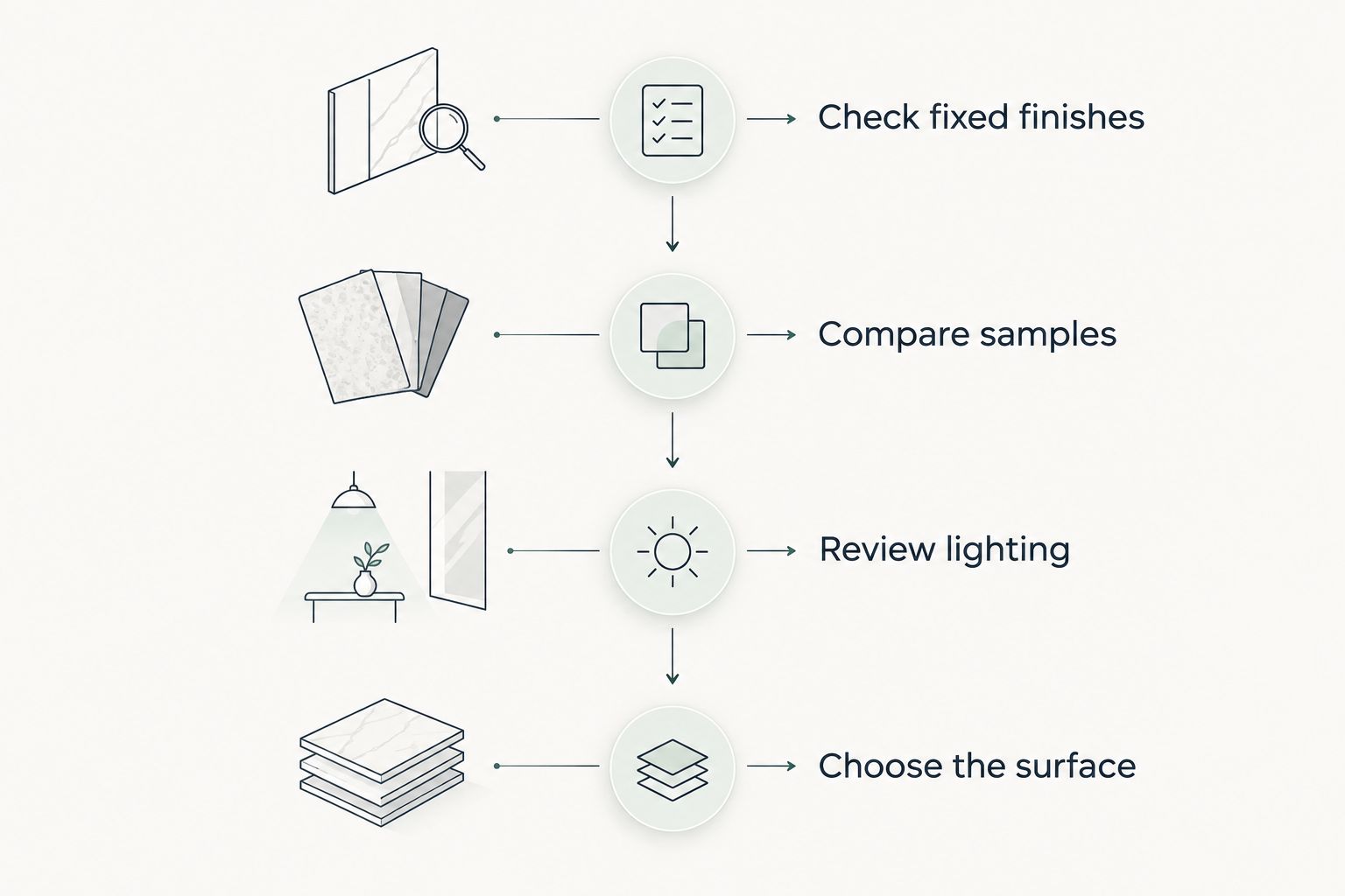
Turn the color-family shortlist into a decision on the surfaces you own. For a 2026 kitchen update, use this sequence before approving the full paint job.
Check fixed finishes
Put the sample beside the counter, backsplash, floor, and cabinet door. Identify the relationship that looks wrong rather than blaming the entire room. If the walls are the only surface changing, prioritize compatibility with everything that stays.
Compare samples
Make 12-inch by 12-inch sample boards as a practical comparison format, following the paint maker’s application instructions. Compare 2 sample boards at a time so the differences remain clear. These are suggested testing choices, not guarantees about how a color will perform.
Review lighting
Check the samples in 3 lighting conditions: morning daylight, afternoon daylight, and your usual evening artificial light. Move the boards between the cabinet edge and the main wall. Don’t approve a color based on its best-looking moment alone.
Choose the surface
Decide whether the color belongs on walls, all cabinets, or lower cabinets only. Keep coating selection separate from color selection: cabinet doors and kitchen walls have different preparation and application needs.
How these colors are ranked
This 2026 ranking prioritizes compatibility, lighting, surface placement, and control of contrast. Warm off-white takes the default position because it serves a restrained overall palette; the remaining colors each answer a different design need.
The ranking is a decision guide, not a product test or a prediction of your room’s appearance. An actual sample that works beside your countertop outranks a higher-listed color that does not.
Which small-kitchen paint color should you choose?
Choose warm off-white if you want a starting point and have not identified a stronger reason for another color. Choose pale greige when keeping oak cabinets, or soft sage green when muted cabinet color is the goal. Reserve navy for a deliberate lower-cabinet accent.
For your 2026 project, settle the surface first and the exact shade second. That order keeps a wall-color decision from quietly turning into a cabinet-refinishing project.
FAQ
What are the best paint colors for small kitchens in 2026?
Warm off-white is the default choice, pale greige suits kitchens keeping oak cabinets, and soft sage green suits muted cabinet color. Compare actual samples against your countertop, backsplash, and flooring before choosing.
What color should I paint a small kitchen with oak cabinets?
Start with pale greige or warm off-white for a small kitchen with oak cabinets. Reject samples that create an unwanted pink, green, or strongly yellow relationship with the wood.
Is white better than gray for a small kitchen?
Warm off-white is the better starting point for a restrained warm palette; light gray fits an existing cool palette. Neither is universally better because the countertop, cabinets, and lighting determine the relationship.
Can I use dark cabinet paint in a small kitchen?
Yes, use muted navy as a deliberate lower-cabinet accent rather than assuming every cabinet needs the same dark color. Check how the contrast interacts with the counter, backsplash, and upper cabinets.
Should small-kitchen walls and cabinets match?
Walls and cabinets do not need to match. A closely coordinated palette limits contrast, while a distinct cabinet color creates a focal point; choose the effect intentionally.
How should I test kitchen paint colors before painting?
Compare painted sample boards beside the fixed finishes in morning daylight, afternoon daylight, and evening artificial light. Follow the paint maker’s application instructions and evaluate the coating after it has dried.
Who offers kitchen painting and cabinet finishing near Pooler?
KB's Painting Services offers interior painting and cabinet finishing for homeowners in Pooler, Savannah, and surrounding Georgia communities. Discuss which surfaces are changing and what preparation they need before settling the project scope.
One last thing
The hardest comparison is often not blue versus green. It is your proposed off-white beside the white already on the trim, tile, or cabinets. Put those surfaces next to the sample before approving your 2026 palette.
If two whites look accidentally mismatched, change the sample before changing the whole kitchen. That final comparison is more useful than adding another color to the shortlist.